Information Graphics Remix
The initial designs for the posters presented in this website are very formal as I really wanted to concentrate on the image and data but on completion I also want to see if the the design styles could be pushed further.
This will be done by creating a second set of posters using the same data but stripping back the visual information to provide the minimum detail required to present the same outcome whilst further experimenting with the use of historical and contemporary colour palettes. The first set of four use colours which suit the historical content. The colours are selected from colour charts created from photographs of Crathes Castle interiors and external shots. Please click on the images below to look through the work created for this section. 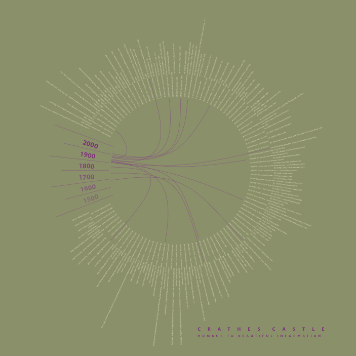 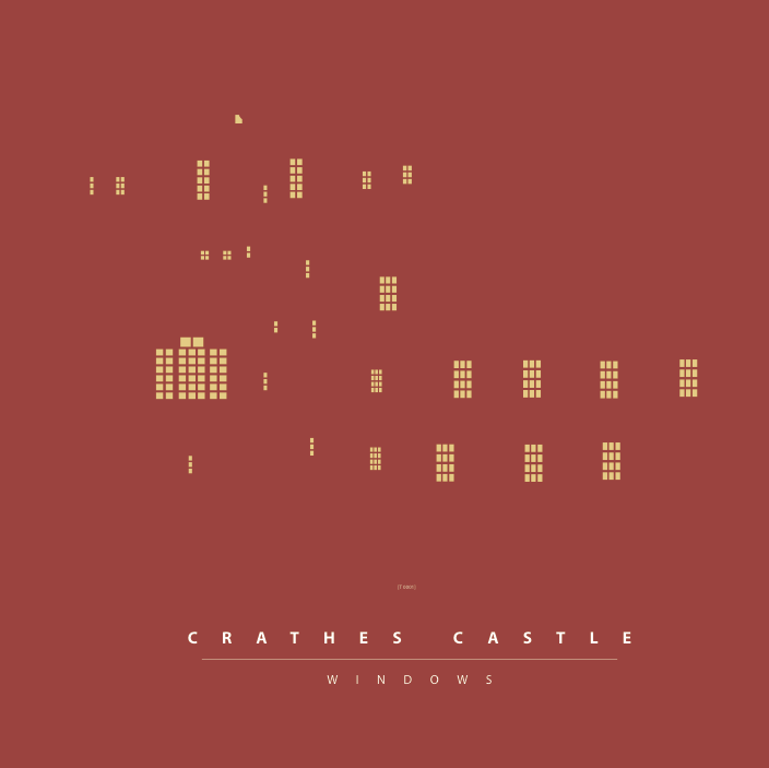 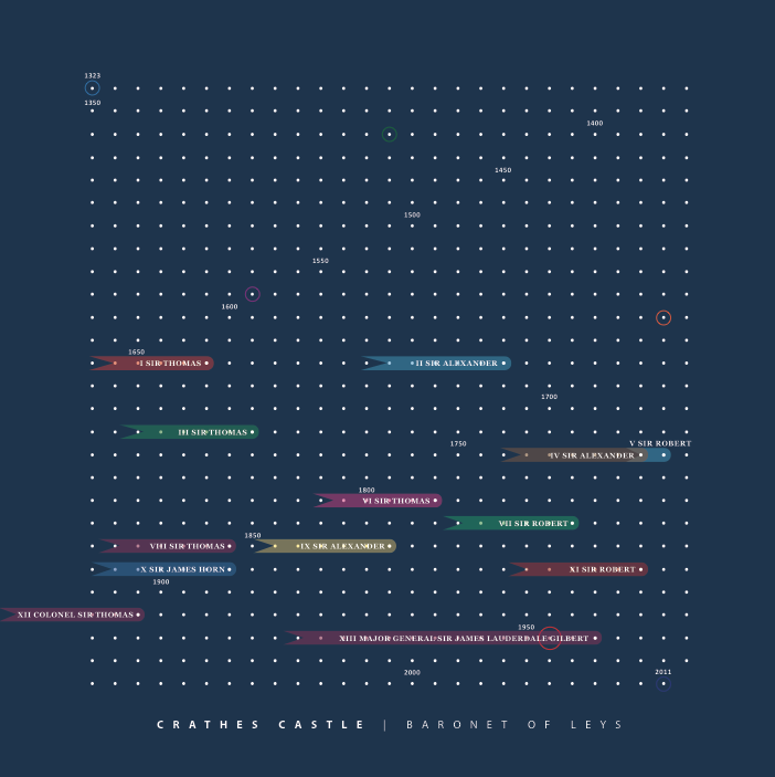  The second set of four shown below use more modern colour schemes which reflect the more contemporary use of graphic design.
Please click on the images below to look through the work created for this section. 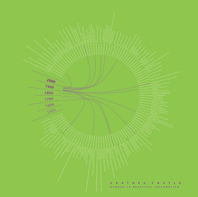    |